Useful tips
Contents
- The rogue wrap-around
- Duplicating a Canvas App Form into SharePoint Integration
- Using Variables when you change the standard design
- Alternate shading in Galleries
- When you do not have to say true or false
- Combining two collections based on order alone
- Restricting users to specified file types in Attachment control
- Finding the newest version of a criteria in a data set
- Rounding to the nearest .5
- Changing the Authoring Version of an App
The rogue wrap-around
When you are designing a (particularly larger) form with a lot of fields and have many card widths different to the standard “equal width” automatically set by Power Apps, you get a long way in, change a card width and suddenly the whole screen of cards rearranges itself to something quite different than the items per line you planned? Sometimes this is a nightmare to fix (you fix one line and another breaks). So how do you avoid (or more accurately) mitigate the effect?
Firstly, frequently you will have a need for different numbers of cards per line and within this naturally different card widths. You may also have a need for the widths of all the cards on the particular line to equal the form width.
Some fundamentals when you have this requirement: –
- Set the cards per line at the maximum number you will need.
- If
- The number on the line is more than one (full width cards are common), AND
- One of the full-width cards is not immediately below the line AND
- it is not the bottom line
Put a custom card one pixel high and the width of the form underneath the line.
- Avoid setting the “final” width of at least one card before you have finished (in other words, leave at least 10 pixels space between the end of the last card and the right edge of the form). You can fix them all when you have finished and everything is where you want it to be.
- If you get a “rogue wrap” now, it will be confined to single lines (they will become two lines, but can be fixed one at a time without affecting anything else).
When you get a rogue wrap, this is what you do
- Reduce the size of one of the cards on the line affected (you may need to take up to 100 pixels off).
- Go into Edit on the form and swap the position of two of the cards on the line then swap them back again. The cards will then “snap” back onto the single line.
- Put the width of the card back to what it was.
Duplicating a Canvas App Form into SharePoint Integration
You have just finished your Canvas app and now you would like users to also have the facility directly from the SharePoint list. You already have the form in the Canvas App set out the way you want, and now need to duplicate this on SharePoint
This is a perceived barrier that really is not one. A lot of people envisage having to maintain two apps or go for the integration option and have to manage the limitations this brings. Any form created in a Canvas App (CA) can be directly copied and pasted into a SharePoint Integration (SPI) screen doing the following: –
- Open both apps on separate screens.
- Connect any additional lists to the SPI app.
- Paste in any OnStart code from the CA to the SPI.
- Adjust the dimensions (particularly the width) of the SPI app to match the CA dimensions.
- Rename the Form of the SPI to match the CA Form name. This automatically takes care of the built-in SPI functions OnView, OnEdit, OnNew and OnSave.
- Delete the SPI form.
- Copy and paste the CA form into the SPI screen (use ctrl-c and ctrl.v) – some position adjustment may be necessary.
- Change the Items of the SPI form now pasted to SharePointIntegration.Selected and it all should work.
- If you update the CA form, repeat step 7
Using Variables when you change the standard design
You do not like the color scheme, font and sizes that Power Apps provides as “standard”. The Themes also do not exactly meet your needs. If you are going to make changes to the design, I recommend you go the extra effort and capture all of this at App OnStart in Variables.
To explain, I generally use a colour scheme around a base colour (generally a dark one) with various shades of ColorFade on different elements. If you set this base color as a Variable (as well as the more commonly used lighter ones), you simply refer to these in the elements of all the controls.
So for example (this is a really dark blue)
Set(varBaseCol,ColorFade(RGBA(9, 33, 98, 1),-30%));
Set(varBaseHover,ColorFade(varBaseCol,85%));
Set(varBaseShade,ColorFade(varBaseCol,90%));
Set(varBasePress,ColorFade(varBaseCol,30%));
Set(varBaseText,Black)
Sets the base, alternate row shade, pressed, hover and Text colours you can apply to all controls, so if in the future, you want the app to be Red, you simply change varBaseColor.
You can apply this logic to everything from particularly the colours above, to control heights and font type/sizes. If you are going to change them, seriously consider doing them in this way.
Alternate shading in Galleries
One of the things that improves the presentation of an app and the readability of a gallery is if “every other” line was able to be shaded. There is no built-in function for this in Power Apps, but it can be done quote easily.
The first thing you need to do is “number” the entries of the gallery. As you also may be sorting and filtering the gallery during the operation of app, this numbering needs to be dynamic to the gallery contents as it changes.
The following is an example of a gallery with two filters based on a list, however it could be any sort and/or filtered gallery. The important part is that the “normal” code goes in the With() statement at the top
With(
   {
      _List:
      Filter(
         SPList,
         StartsWith(
            Title,
            SearchBox.Text
         ) &&
         Status = ddStatus.Selected.Value
      )
   },
   ForAll(
      Sequence(CountRows(_List)),
      Patch(
         Index(
            _List,
            Value
         ),
         {RowNo: Value}
      )
   )
)
This code adds a numeric field called RowNo to every item in the gallery and will always be numbered from 1 to the gallery item total, on the gallery items present, in the order they appear.
Now the alternate shading – the TemplateFill of the Gallery, also allowing for a different color on the selected item
If(
   ThisItem.IsSelected,
   LightGreen,
   If(
      Mod(
         ThisItem.RowNo,
         2
      ) = 0,
      White,
      LightBlue
   )
)
When you do not have to say true or false
This is a misunderstood subject to some degree and once you grasp it, you will save a lot of unneeded code. Boolean (true/false) values can only have two possible outcomes. We are accustomed to Boolean fields (although they are best avoided for other reasons) , but all If() statements can only have one of two results (they are true or not).
Some control properties are also Boolean results – for example Visible. When you want to set the Visible property of a control conditionally, you might say something like on a button
If(
   CheckBox.Value = true,
   true,
   false
)
So, if the control was checked, the button would appear. You can actually get rid of all the brackets and true / false statements and the Visible property of the button is simply
CheckBox.ValueWhat is happening here? The CheckBox value is either true or false, so set the Visible property of the control to whatever that value is.
This can be extended to quite complex statements – using the same button
(CheckBox.Value && !IsBlank(SearchBox.Text) || Dropdown.Selected.Value = "All"If all of that is true, the button will appear – if any of it is false, the button will not be visible
This principal can be extended across all statements where a Boolean result is required and can also be done in the reverse – the ! operator means Not() and in the first statement above, the button would not be visible if the checkbox was checked
!CheckBox.ValueCombining two collections based on order alone
There are times that you have two sets of data that you want to turn into one and they are actually “matching” in order, but have no common field. The number of fields in each does not matter, however you need to pick one (generally the one with the most fields), then add the fields from the other one. The example below only has one field in the first and two in the second, but show the principle of adding consecutive numbers to each and then joining them.
This uses two collections – the collection process is only an example for testing and producing the resulting data sets to demonstrate the code needed to combine them.
ClearCollect(
   col1,
   {Field1: "a"},
   {Field1: "b"},
   {Field1: "c"},
   {Field1: "d"},
   {Field1: "e"}
);
ClearCollect(
   col2,
   {Field2: 11, Field3:"Data1"},
   {Field2: 12, Field3:"Data2"},
   {Field2: 13, Field3:"Data3"},
   {Field2: 14, Field3:"Data4"},
   {Field2: 15, Field3:"Data5"}
);
The resulting collections will have five records each and then we need to make these one collection of five records with both fields.
With(
   {
      wC1:
      ForAll(
         Sequence(
            CountRows(col1)
         ),
         Patch(
            Index(
               col1,
               Value
            ),
            {RowNo1: Value}
         )
      ),
      wC2:
      ForAll(
         Sequence(
            CountRows(col2)
         ),
         Patch(
            Index(
               col2,
               Value
            ),
            {RowNo2: Value}
         )
      )
   },
   ClearCollect(
      col3,
      AddColumns(
         wC1,
         "OtherField2",
         LookUp(
            wC2,
            RowNo2 = RowNo1
         ).Field2,
		 "OtherField3",
         LookUp(
            wC2,
            RowNo2 = RowNo1
         ).Field3
      )
   )
)
I have only used one field in the first list, but it could be 100 – they will all come across and the two fields from the second collection will be added to them. If you have more than two fields in the second collection, just repeat the “OtherField” Lookup.
Restricting users to specified file types in Attachment control
This is a fairly straight-forward, but useful function to restrict users uploading attachments to file type specified. The example below restricts to JPG or PNG, but could be anything you choose. As soon as a non-allowed file is uploaded, it is immediately deleted and a message displayed regarding allowed file types. This code needs to go at OnAddFile in the Attachment control.
With(
   {
      _Type:
      Right(
         Last(Self.Attachments).Name,
         3
      )
   },
   If(
      _Type <> "jpg" && _Type <> "png",
      Notify(
         "Only JPG or PNG files Allowed",
         Error
      );
      Reset(Self)
   )
)
You could also set a more prominent message label visibility off a variable triggered in the bottom If() statement if the Notification ribbon at the top is not sufficient.
Finding the newest versions of a criteria in a data set
Have you ever wanted to find the newest/latest of all the different categories in a data set? For instance, the latest sale by each sales person, the last registration by a person – and generate a list of these.
Firstly, a disclaimer here as the function used is not Delegable, however if all records you are looking for are in the newest 2,000 records, then read on. I am also assuming SharePoint as a data source in the example below. Firstly, the code required
With(
   {
      _Group:
      AddColumns(
         GroupBy(
            Sort(
               YourSPList,
               ID,
               Descending
            ),
            "YourIdentifyField",
            "OtherData"
         ),
         "IDMatch",
         First(OtherData).ID
      )
   },
   ForAll(
      _Group,
      Collect(
         YourCollection,
         LookUp(
            YourSPList,
            ID = IDMatch
         )
      )
   )
)
To explain what is going on here: –
- The list is firstly sorted by ID descending, presenting the newest 2,000 (if you have your limit set to this) records,
- It is then grouped by the selection criteria (person name field in example above) with the table of all other matching fields in the column OtherData, You can also group by multiple fields.
- The field IDMatch is then added representing the first ID in each OtherData set (which is the newest one).
- The output of the With statement above is a table containing two fields, the selection criteria field and more importantly IDMatch, the ID of the newest record in each matching set.
- A collection is then made by looping through this table and gathering all the records from the original table with the ID in wGroup.
Rounding to the nearest .5
It is easy enough to round (nearest, up or down) to a specified number of decimal places, but what if you want to round to the nearest half? This is not something “standard in functions provided, so a combination of other things is required. Firstly, the code
With(
   {
      _Val: YourValue,
      _Int:
      RoundDown(
         YourValue,
         0
      )
   },
   _Int +
   Round(
      Mod(
         _Val,
         _Int
      ) / 5,
      1
   ) * 5
)
To explain how it works
- The two values at the top are only to avoid repetitive typing. The first wVal is simply the value being rounded and the second wInt is the “Whole number” part of it.
- We firstly take the whole number then
- Get the decimal part by taking the Mod (remainder) of dividing the wVal by wInt
- This is then divided by 5 and rounded to the nearest single decimal place,
- This produces one of three results – 0 for under .25, 0.1 for under 0.75 or 0.2 for over this.
- This is then multiplied by 5 to produce 0, 0.5 or 1 (which rounds up to the next number).
Changing the Authoring Version of an App
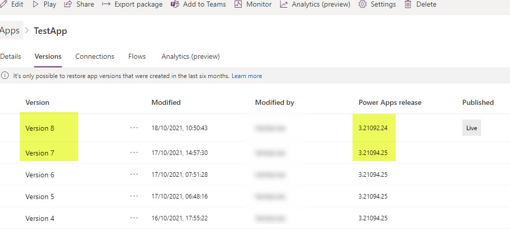
There are times unfortunately that Power Apps releases a new Authoring Version in the Design Studio that does not always perform as expected. Any app last saved in this new version may be affected by whatever the deficiency is and an updated version of an app with minor changes may suddenly develop unwanted characteristics. The easiest way to see if it is the version that is causing these issues is to re-publish the app on an earlier version, the best being the last one (before the most recent) it was saved in and was working properly.
This is quite a straight-forward process, but can be a little confusing if you do not know how it works.
The first thing to do is open the app that you want to revert in Edit mode, then choose File > Settings > Support as below.
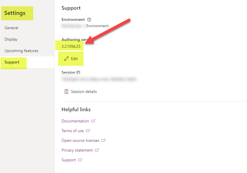
On this page you will see the current Authoring Version – now select the Edit icon
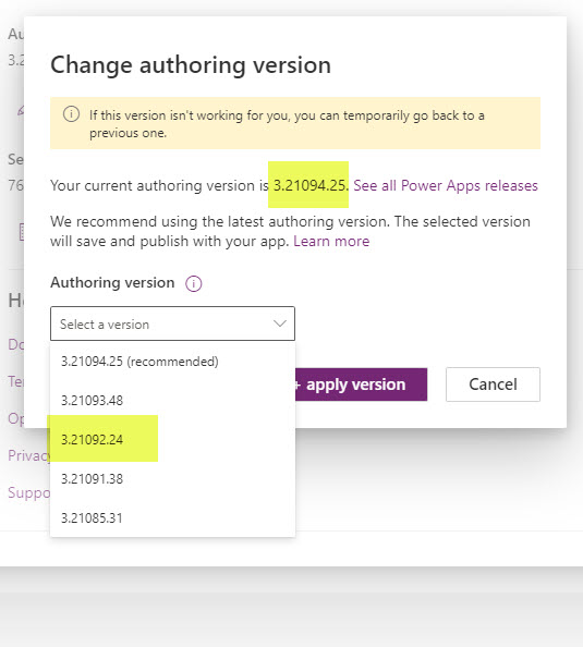
Select the version you wish to revert to – in the above it is two versions before.
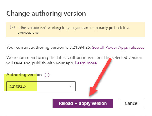
Select the version you need and then select Reload + apply version
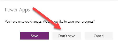
Now the slightly confusing part – you have not changed anything presently, just set the Studio to reload the app in the desired Version, so unless you have changed something in the app in this session, select Don’t save when asked
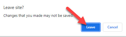
and then Leave Site
Your app will then reload – check the end of the URL to ensure it is loaded in the correct version

All that is left now is to Save and Publish your app – NOTE sometimes you need to make a slight change to something for the Save option to be activated.
After you have done this, go back to your app list and click on the “three dots” then Details
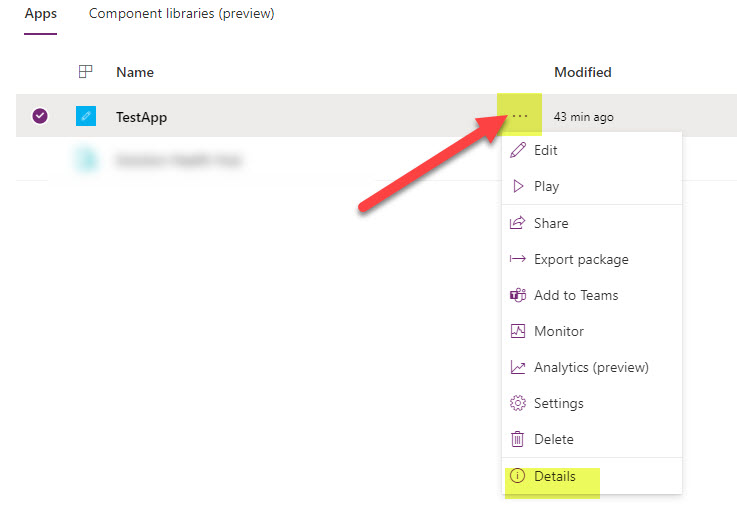
then ensure that your app have been published in the required version